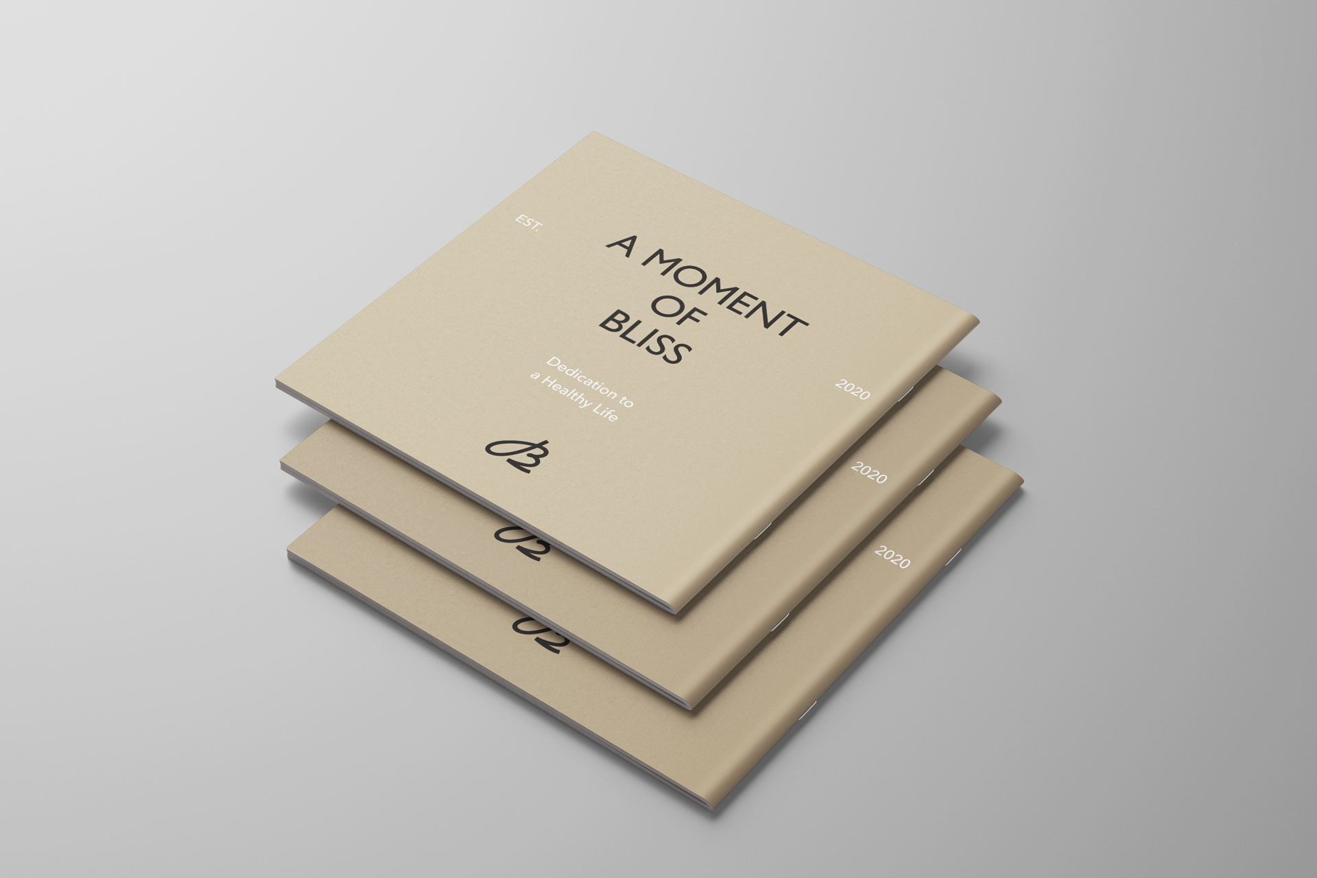
Bliss Fit
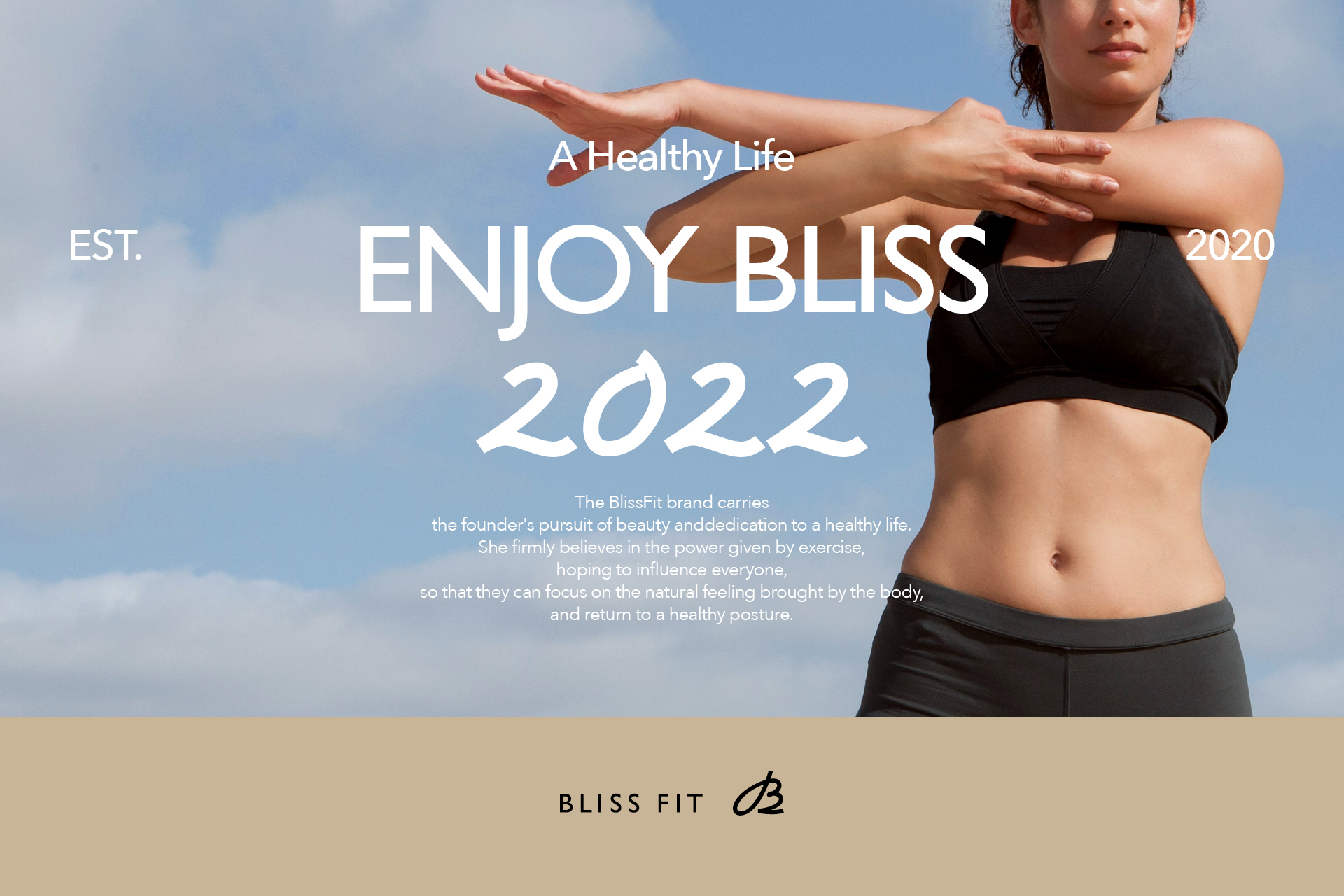
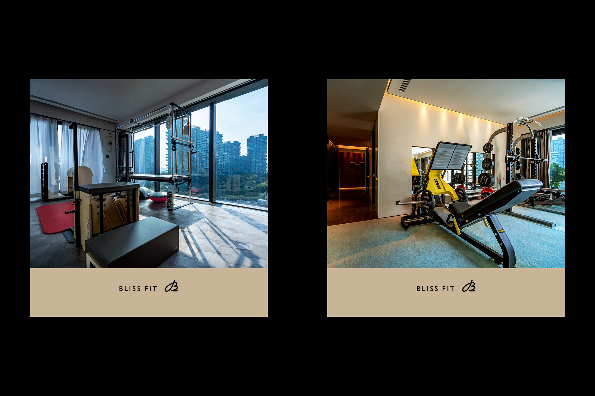
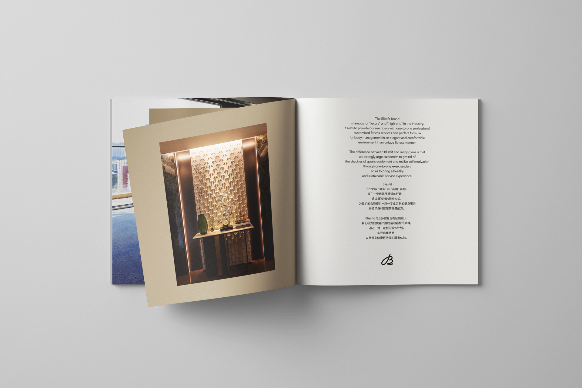
As a fitness brand positioned as health management and sports services, BlissFit hopes to offer the audience not only an elegant and comfortable sports experience environment, but also a perceptual lifestyle focusing on the return of the body to a healthy state.
The significance of its rebranding is to find a more suitable visual image to match the future development deployment of the brand, and establish a high-quality, unique and stable visual system through complete brand image design, so as to improve the use experience of the audience.
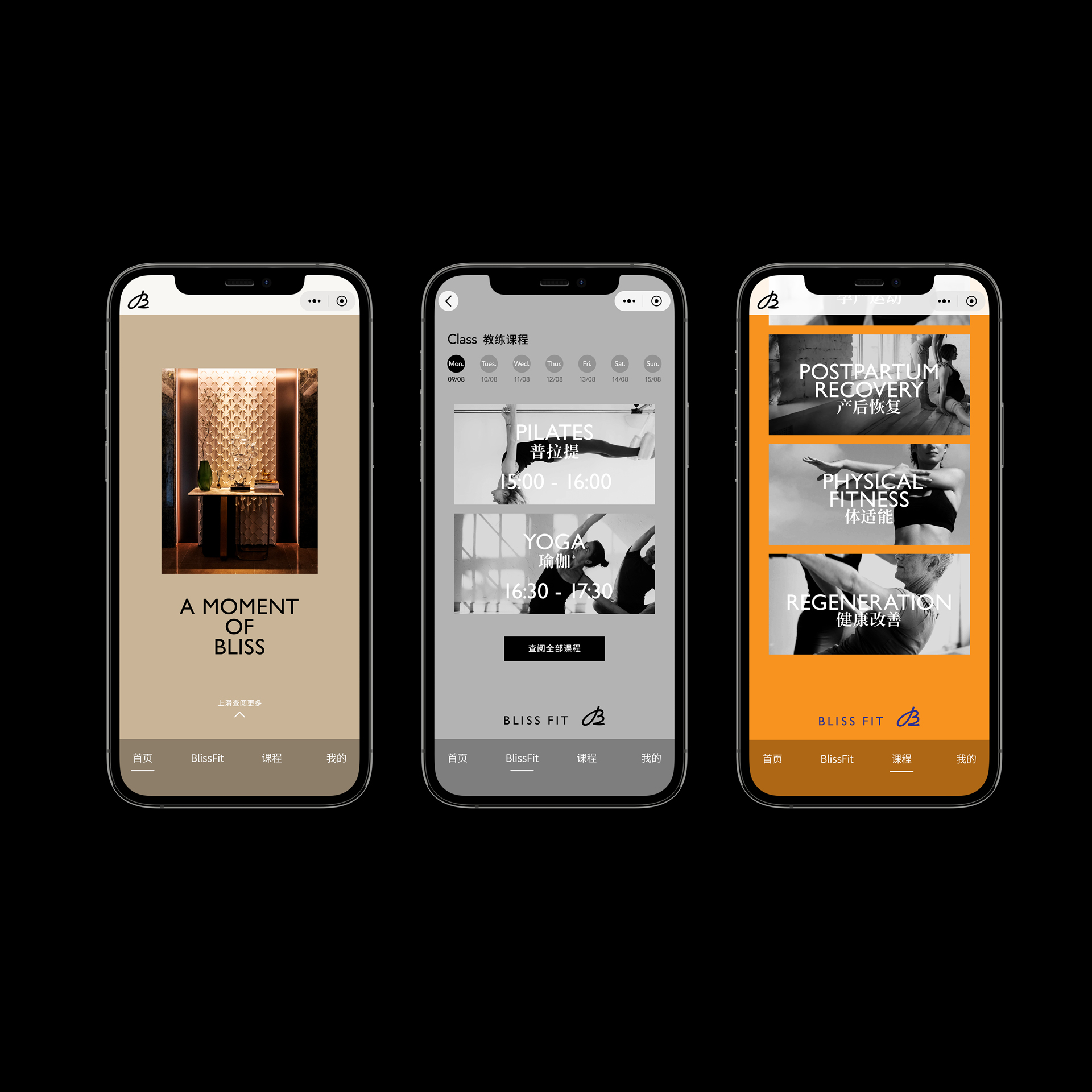
In the process of rebranding, we found that the founder of BlissFit has a unique and ultimate pursuit of the power of life given by sports. This pursuit is presented with BlissFit’s love of sports, and it is elegant and comfortable, healthy and pleasant, rigorous and delicate. Based on such keywords, we have constructed BlissFit’s brand values and run them through all aspects of the brand, including fonts, graphics, color, layout and picture rules are extended from offline to online mobile terminal experience. All touch points between the brand and the audience implement the values of BlissFit, so as to give full play to the unity of the brand image.
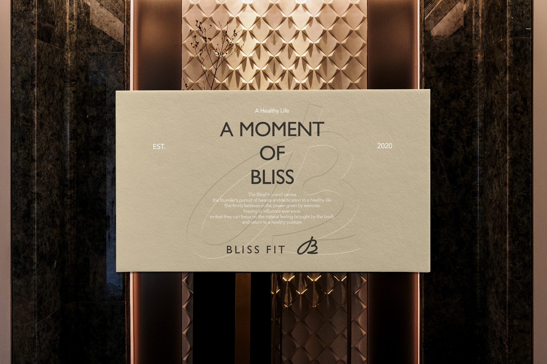
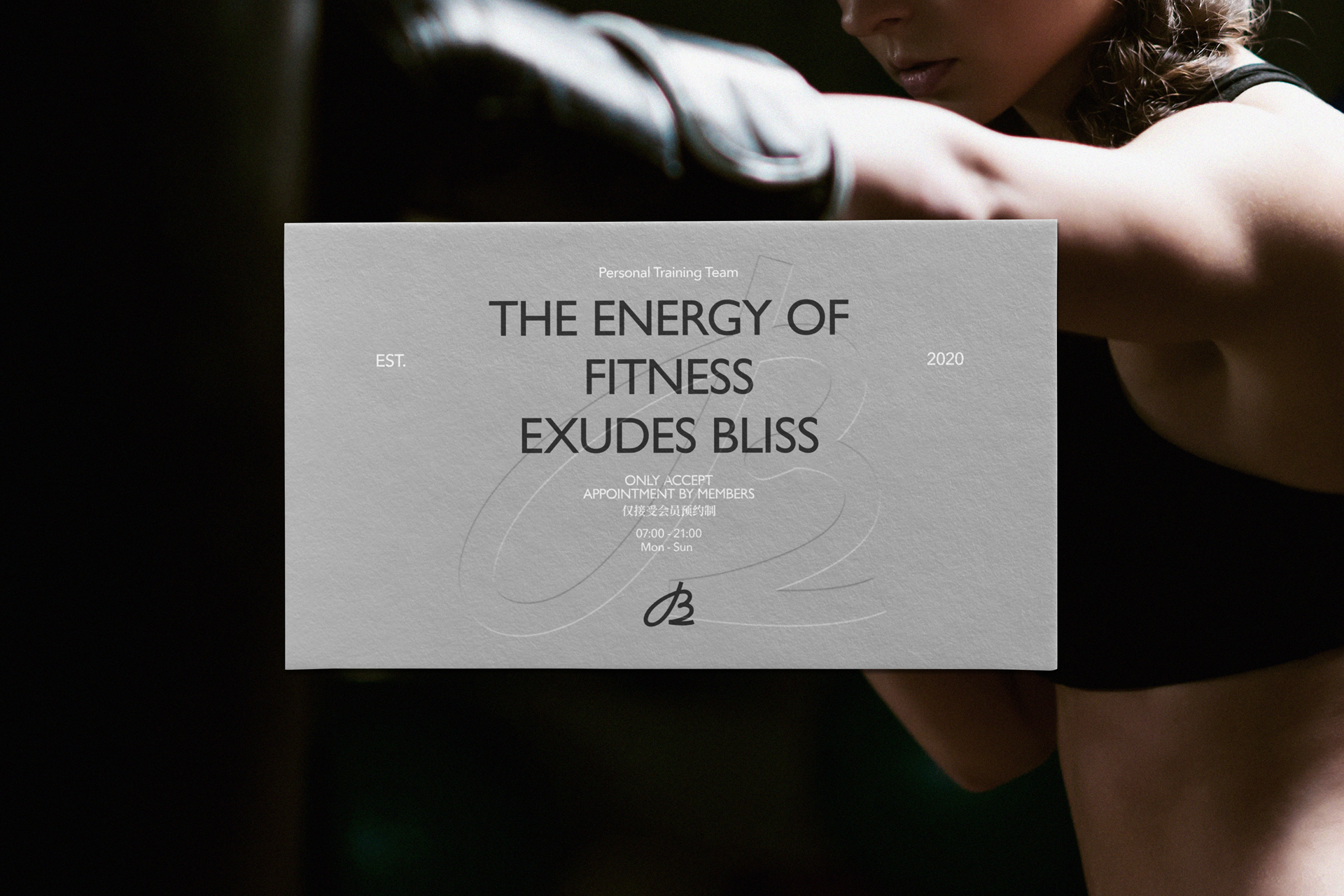
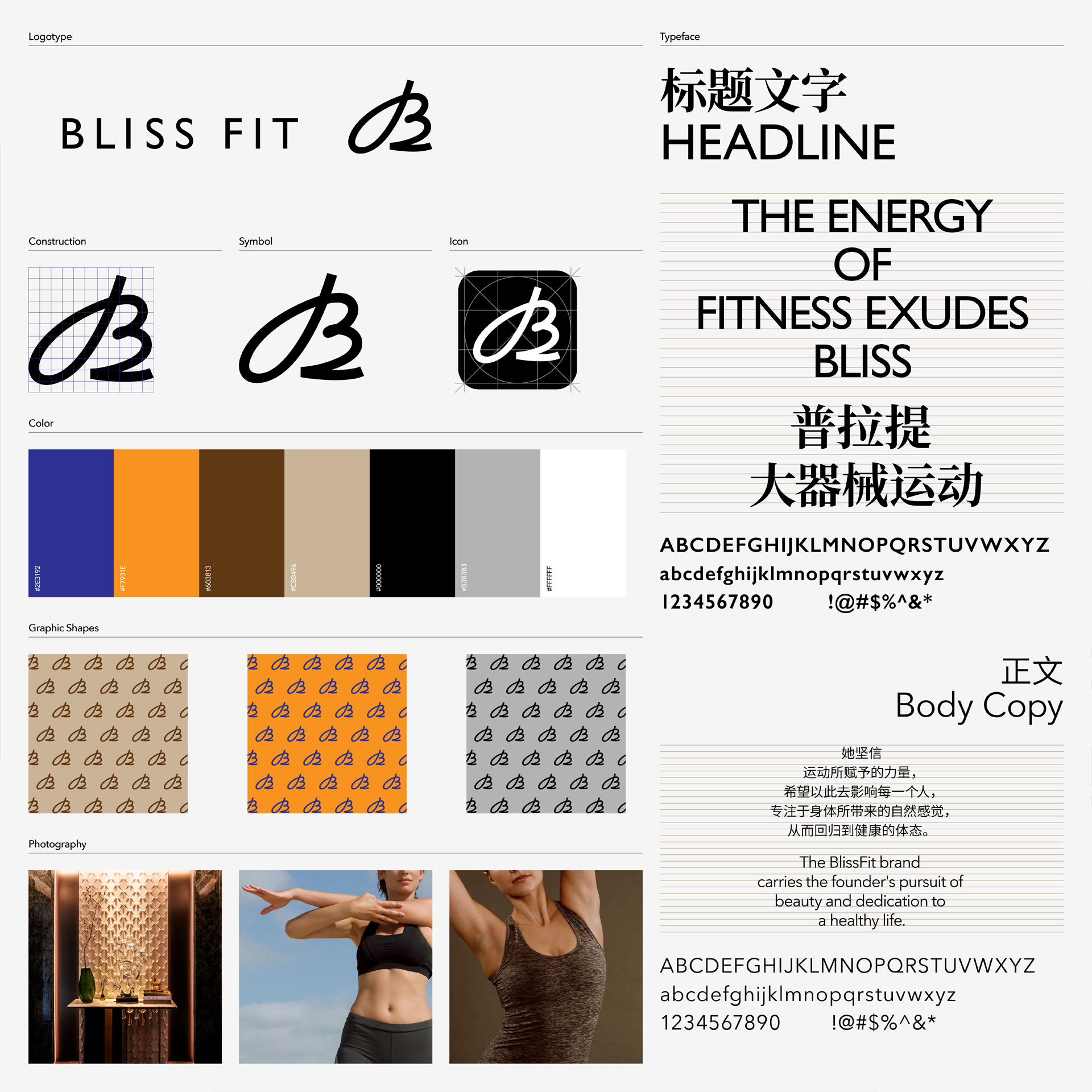
The logo of BlissFit consists of handwritten symbol and logotype.
Since the handwritten symbol is one of the main identification elements of the brand, we have redrawn the Roman typeface from Latin letter B. It retains the elegance of Western calligraphy and adds modern refining details to make it more dignified and delicate.
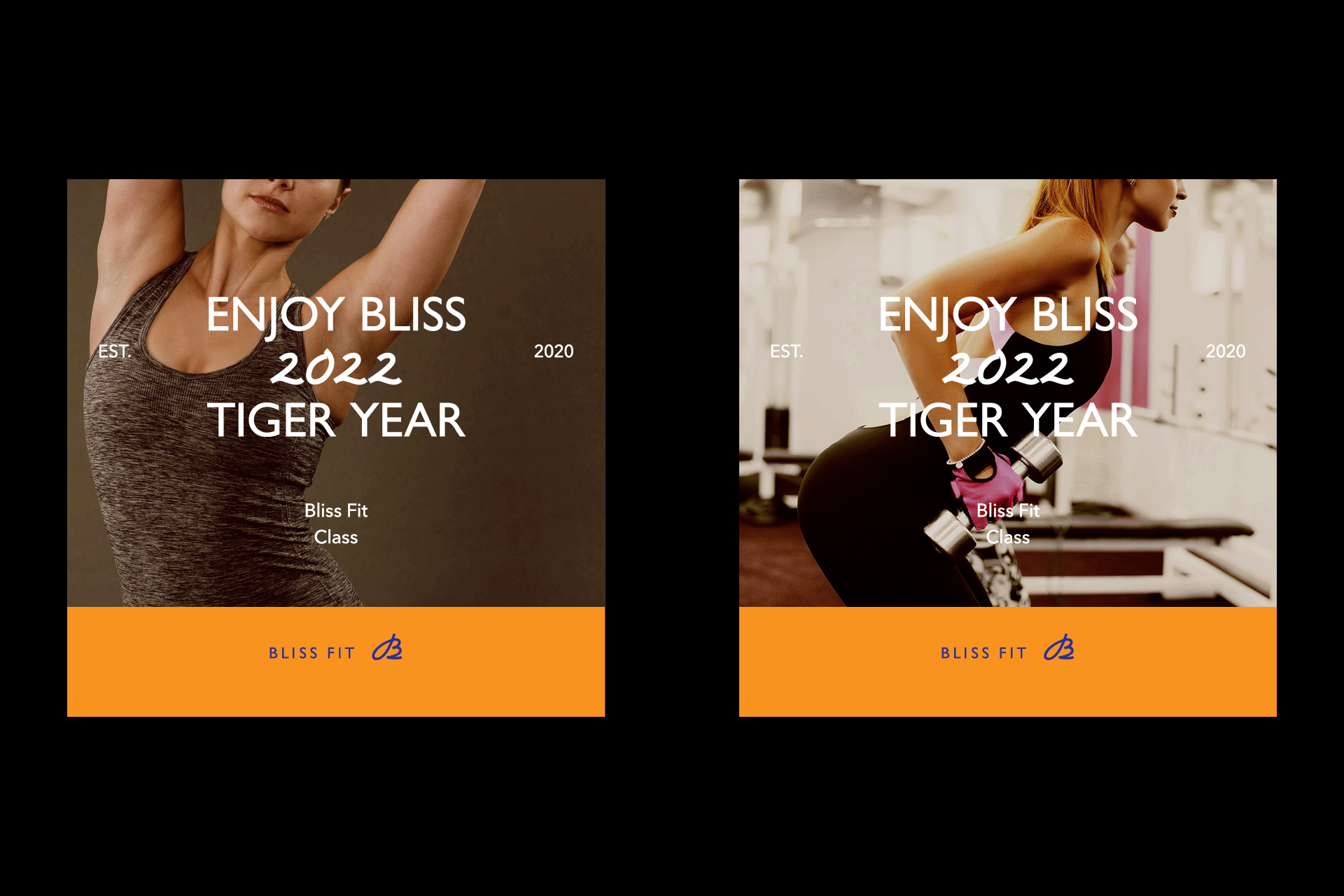
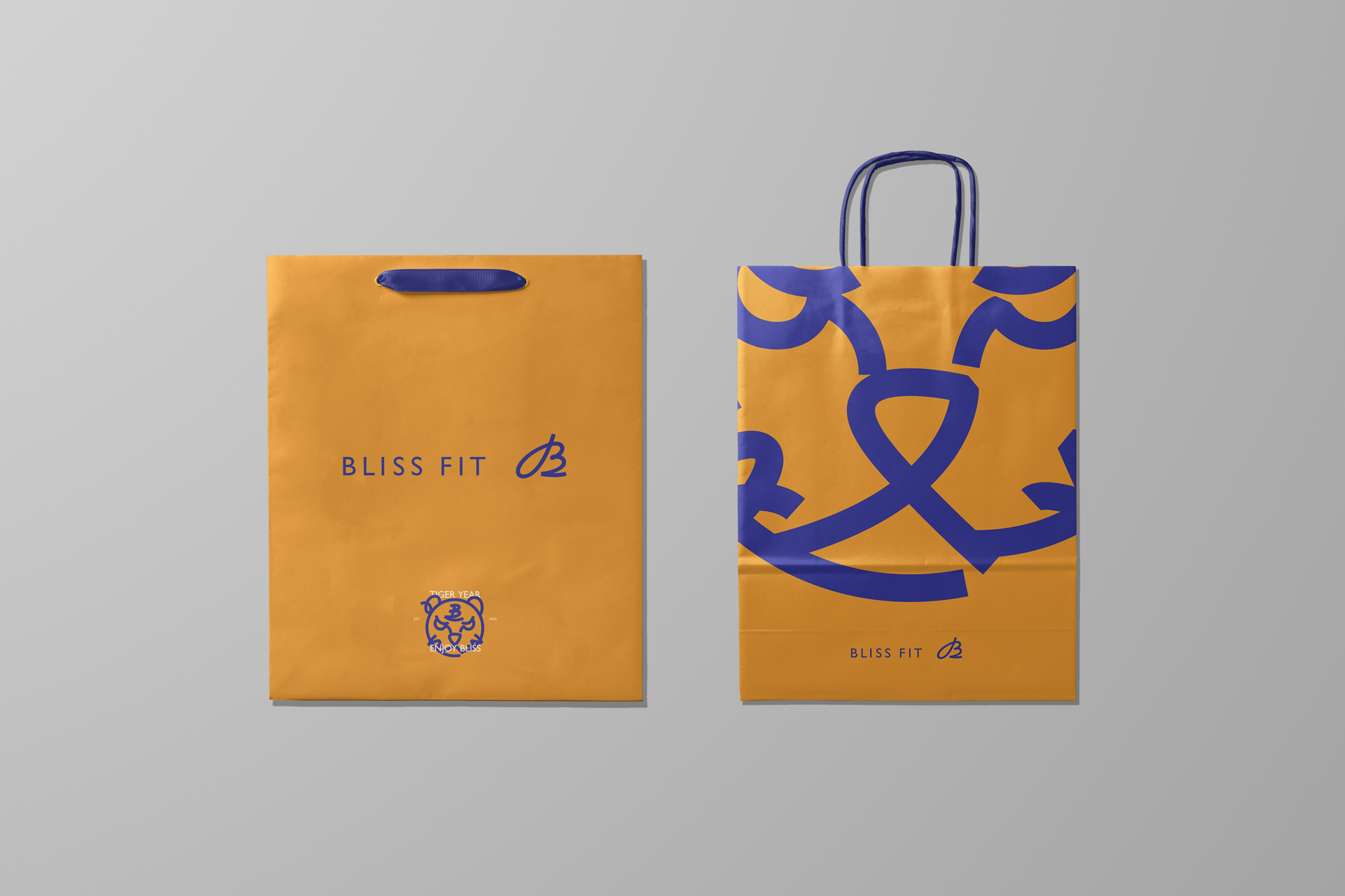
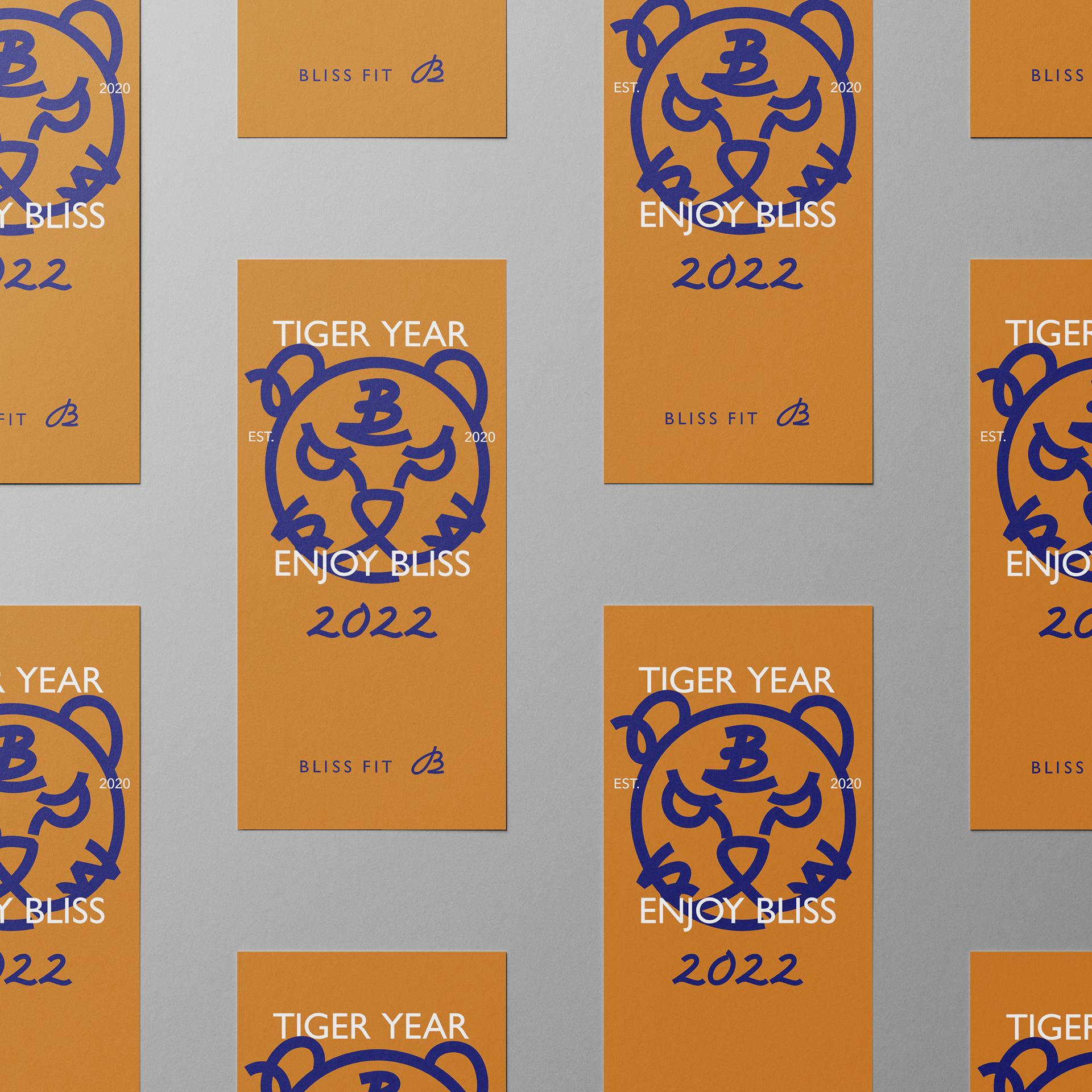
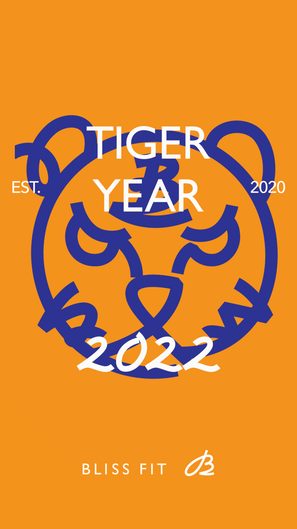
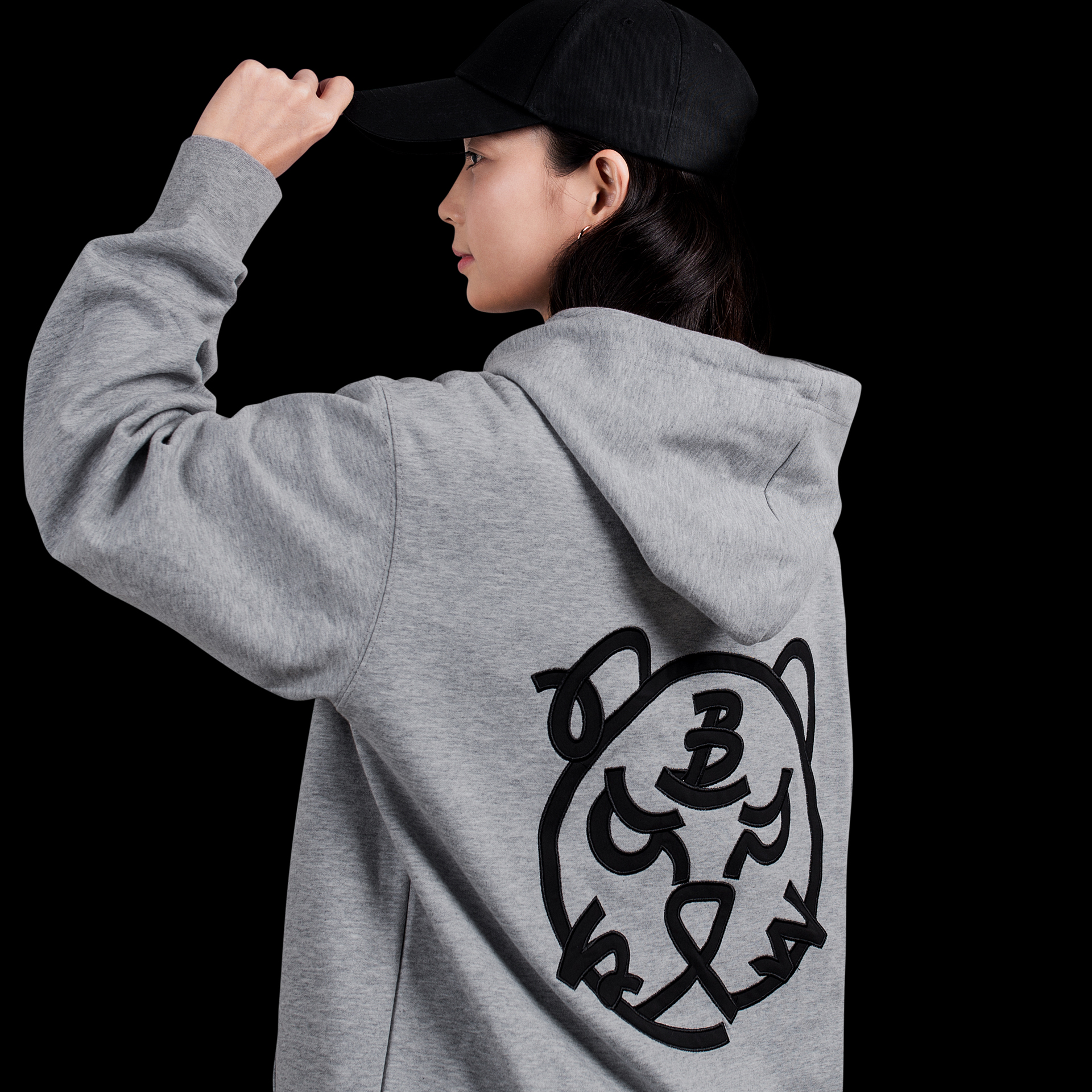
This design language is also extended to the graphic elements of the Year of Tiger in 2022. The overall trend is consistent with the symbol of handwritten B, which is delicate, relaxed and full of modernity.
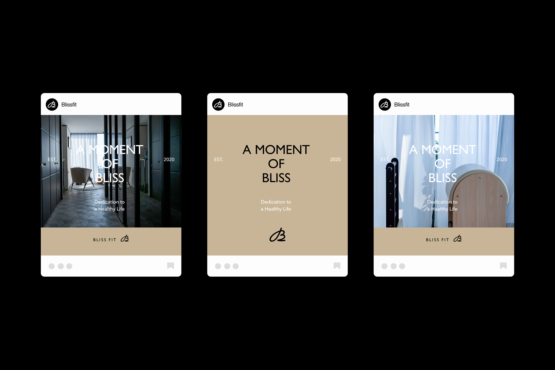
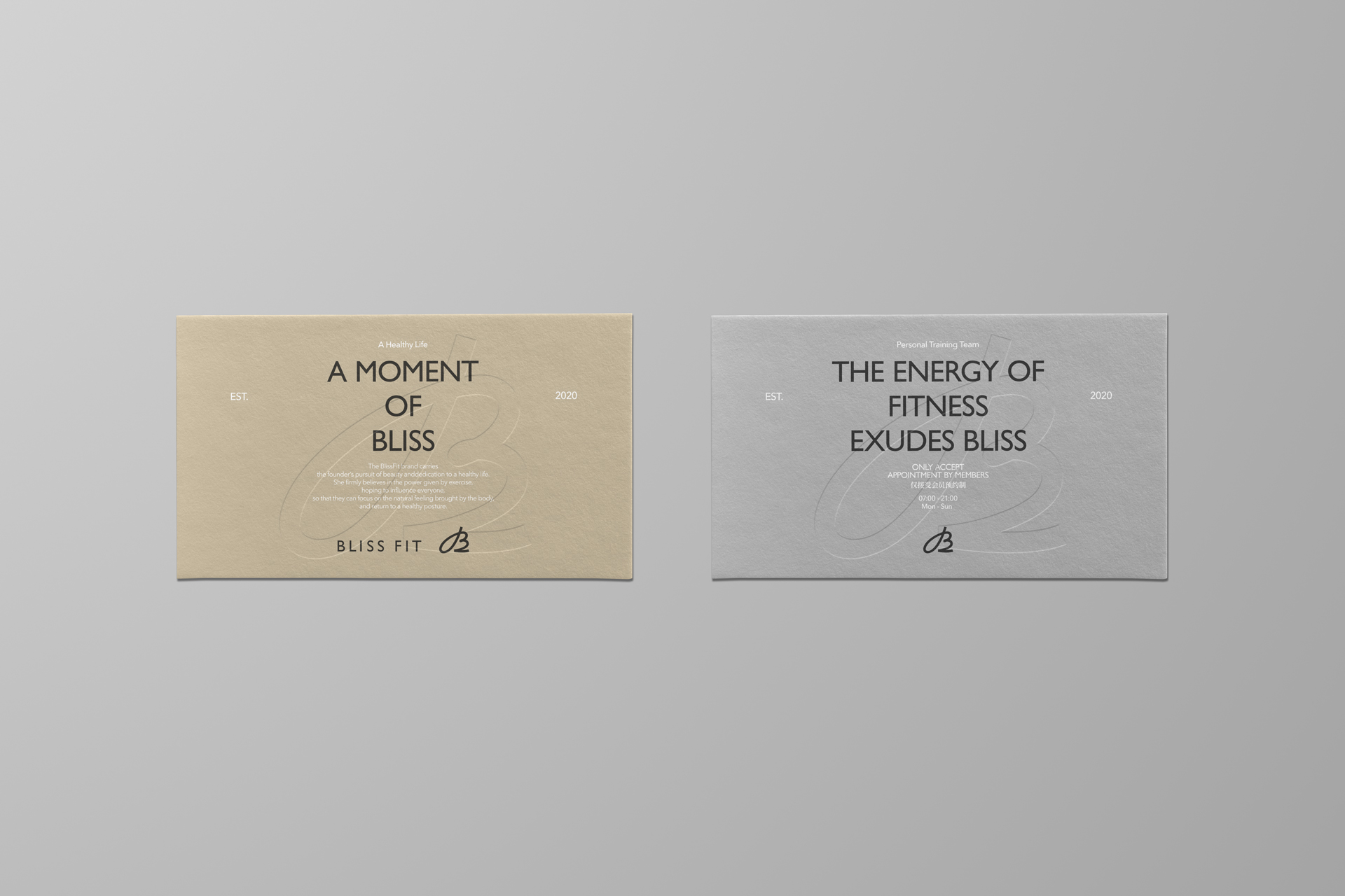
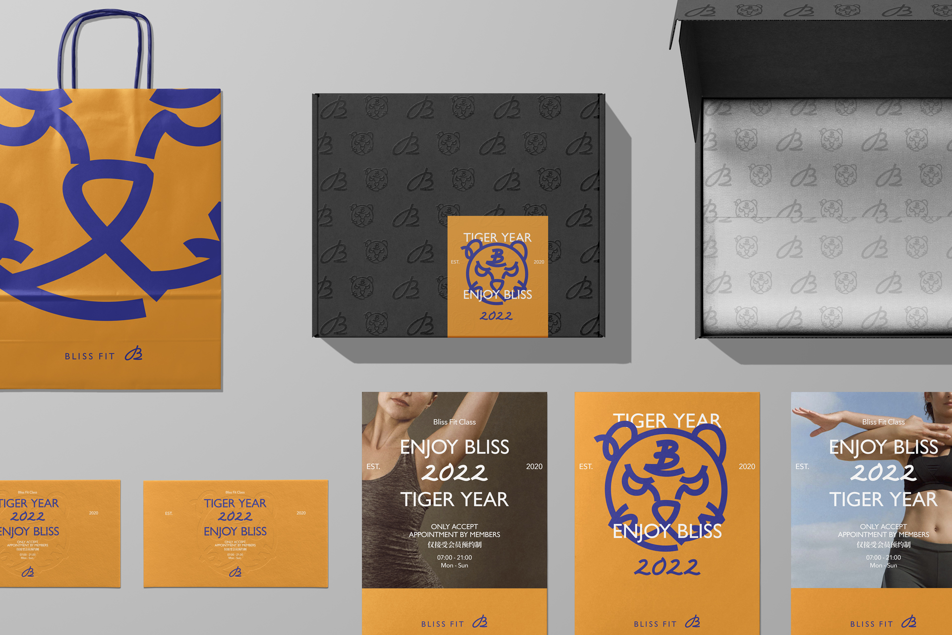
In the application of brand image, we extracted apricot which means warm and comfortable, orange which means vibrant and pleasant, and gray which means rigorous and focused, combined with brand symbol and tiger graphics, to adapt to different scenes and create different atmospheres by scaling up, scaling down, tiling, cropping and dynamic effects. Through this brand image update and application, we look forward to further brand development of BlissFit in the future.
BlissFit 作为一个定位于健康管理与运动服务的健身品牌,希望带给受众不仅是一个优雅舒适的运动体验环境,更是一种关注于身体回归健康体态的感性生活方式。
其品牌升级的意义,在于寻找更贴合的视觉形象以配合品牌未来的发展部署,通过完整的品牌形象设计,建立起高品质的、独特而稳定的视觉体系,从而提升受众的使用体验。
在品牌升级的过程中,我们发现 BlissFit 的创始人对运动所赋予生命的力量有着一种独特而极致的追求,这种追求呈现于 BlissFit 对运动的热爱,是优雅舒适的、是健康愉悦的、亦是严谨细腻的,正是基于这样的关键词,我们构建了 BlissFit 的品牌价值观,并将其贯穿于品牌的各个方面,包括字体、图形、色彩、版式和图片规则等,从线下延展至线上移动端体验,品牌与受众的各个接触点都贯彻了 BlissFit 的价值观,以此将品牌形象的统一性发挥至极致。
BlissFit 的标识由手写体图形标与文字标两个部分组成。图形标作为品牌的主要识别元素之一,我们对取自于西文 B 的罗马体进行了重新绘制,保留了西文书法的优雅美感,同时增加现代洗炼的细节,使其更具端庄细腻的特征。这种设计语言亦延伸至 2022 虎年的图形元素中,整体趋势与手写体 B 的图形标保持一致,细腻舒展并充满现代感。
在品牌形象的应用中,我们提取了寓意温暖舒适的杏色、活力愉悦的橙色以及严谨专注的灰色,配合品牌图形标与虎头图形,通过放大、缩小、平铺、裁切、动效等方式来适配不同的场景,营造不同的氛围。通过本次的品牌形象更新和展开应用,我们期待未来 BlissFit 更进一步的品牌发展。