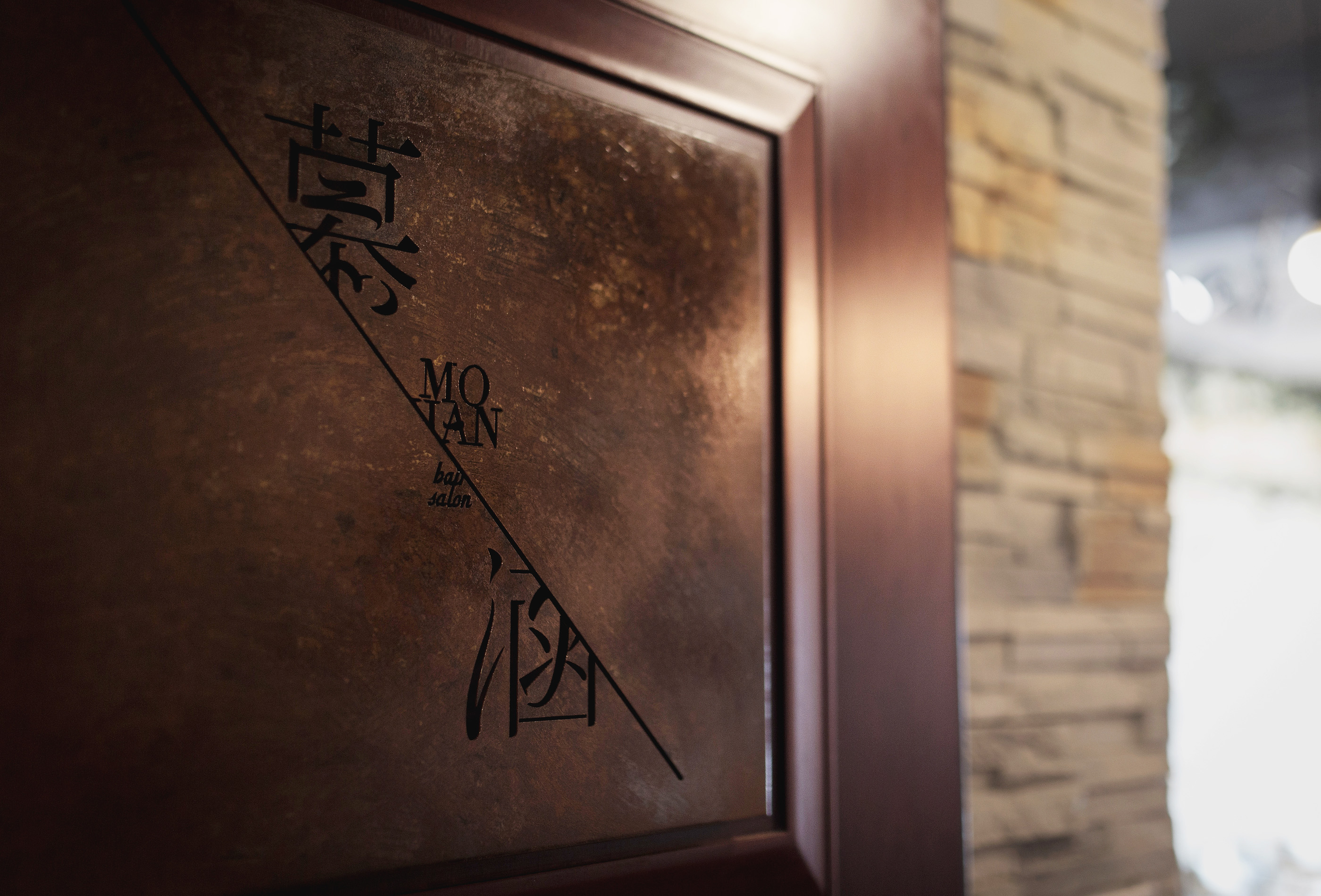
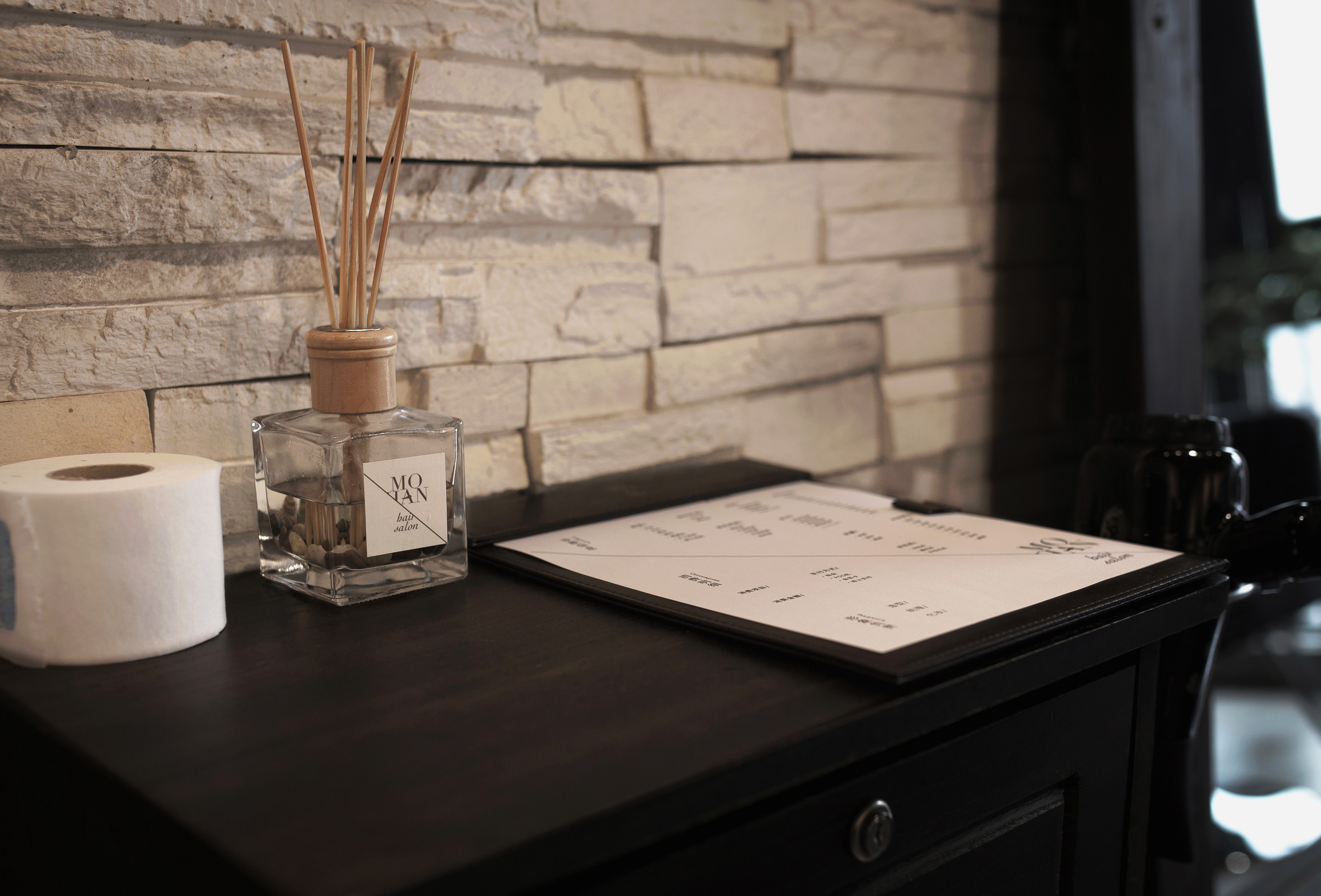
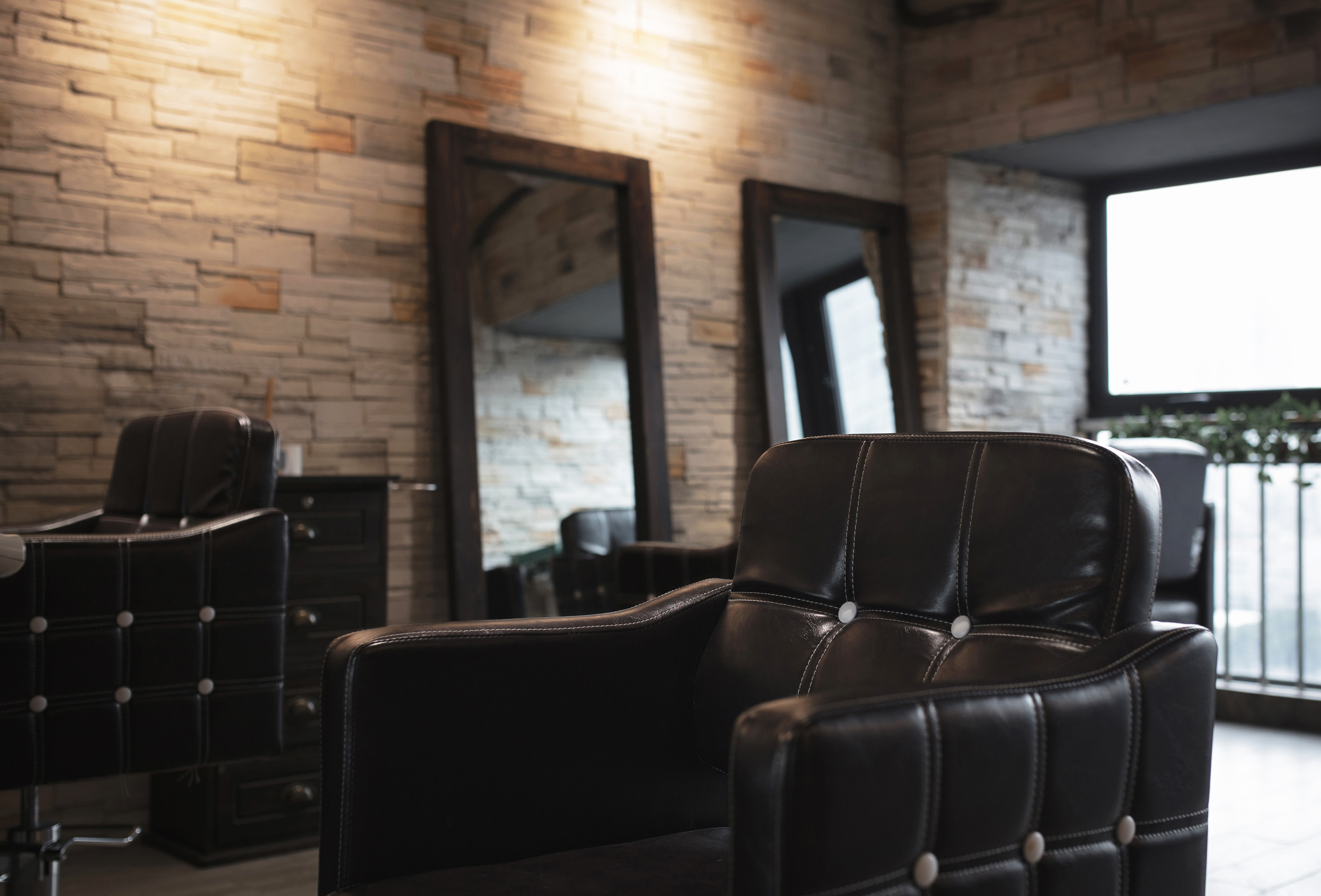
MOHAN
MOHAN is a hair salon focusing on urban young lady image. The director hopes to help each guest to exploit the pursuit and appreciation of ego inner beauty through style design, other than a simple outer image change. Therefore its brand image abandoned the previous industrial stereotyped image mainly with picture of scissor, comb, etc., and introduce the concept of mirror refraction to recombine the Chinese-English typefaces which are seemingly lost, to forge a kind of interesting and elegant visual perception, inspire people to longing for “beauty” as well.