Montwave
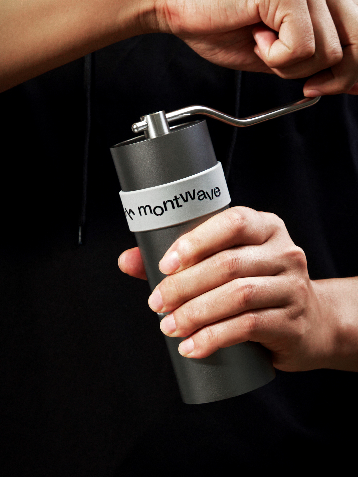
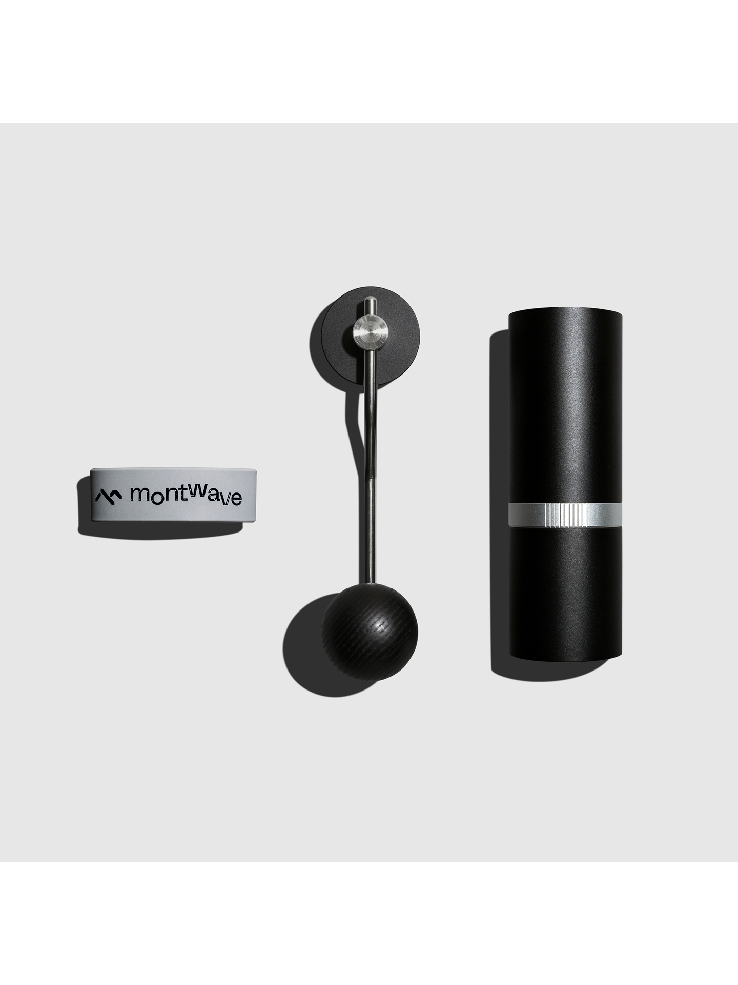
Montwave is specialized in design and manufacture of domestic bontique coffee widgets. We continue to explore the balance between high performance and ease of use of such widgets on different scenarios from a perspective of product underlying logic and structural shape.
We insist on the philosophy of “rationality, rigor and wealthiness of humanity” to create products which can generate a emotional connection in the long-term use by the users with high standard and diversified materials and production processes.
Montwave means continuous mountain trends. It seems like the process of cooking coffee and this is a living art about stabilit and flowing.
We undertakes the branding design of the logo, product package, printed matter and E-commerce platform identity system setup. A power of rational pragmatism and perceptual humanity temperature connection is injected into brand new visual identity design laid out in the global coffee widget segment.
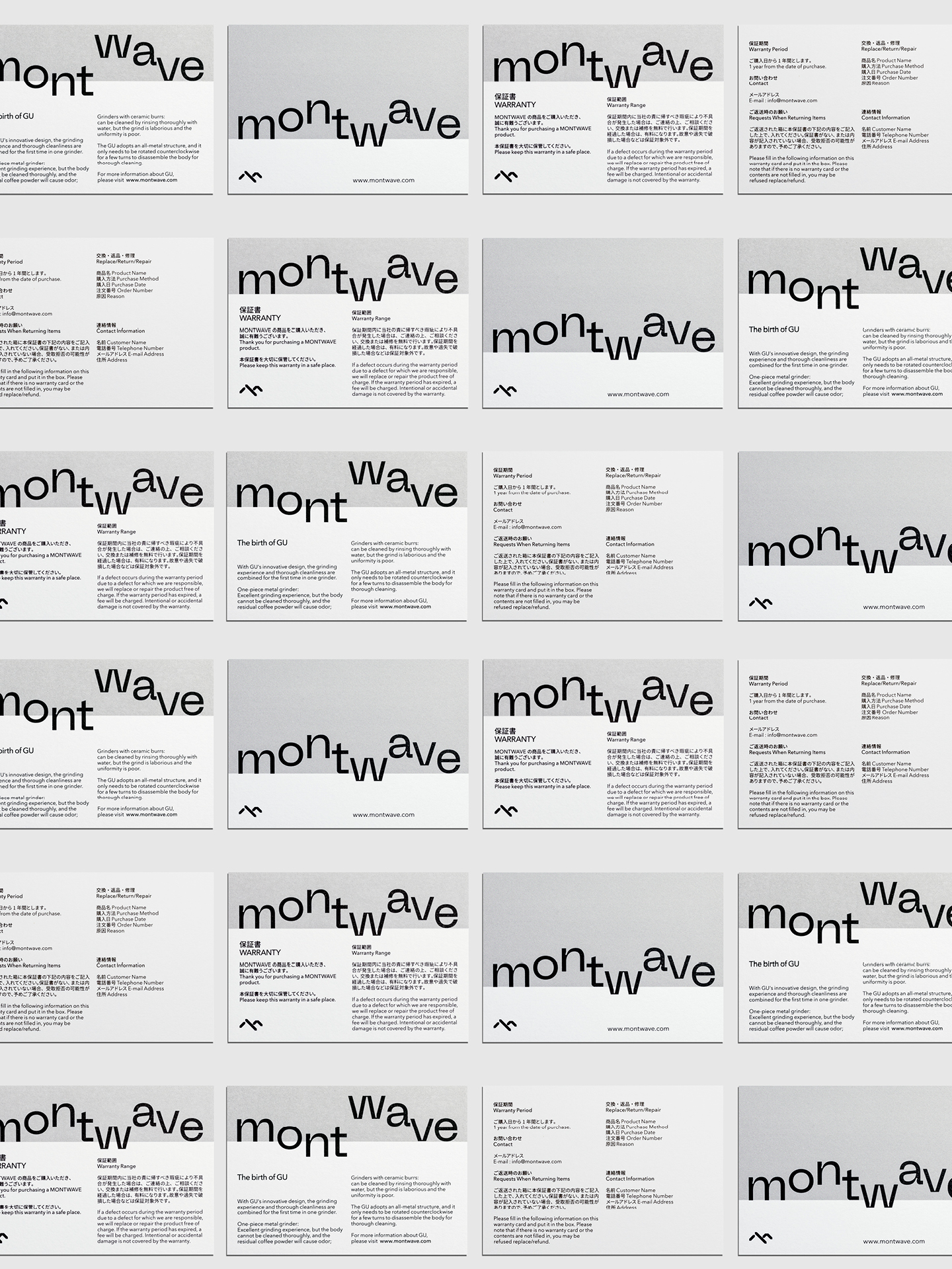
In the development of branding design strategy, our goal is not only to enable the brand to take an image of vision memory but also to hope to establish a visual identity system which attach importance to changeability, unified continuation and practical functionality.
Emotional connection rich in humanity seems like the flowing of mountains. It together evolves as the identity system with the high standard stability brought by excellence technique. It is the important brand visual identity asset of Montwave.
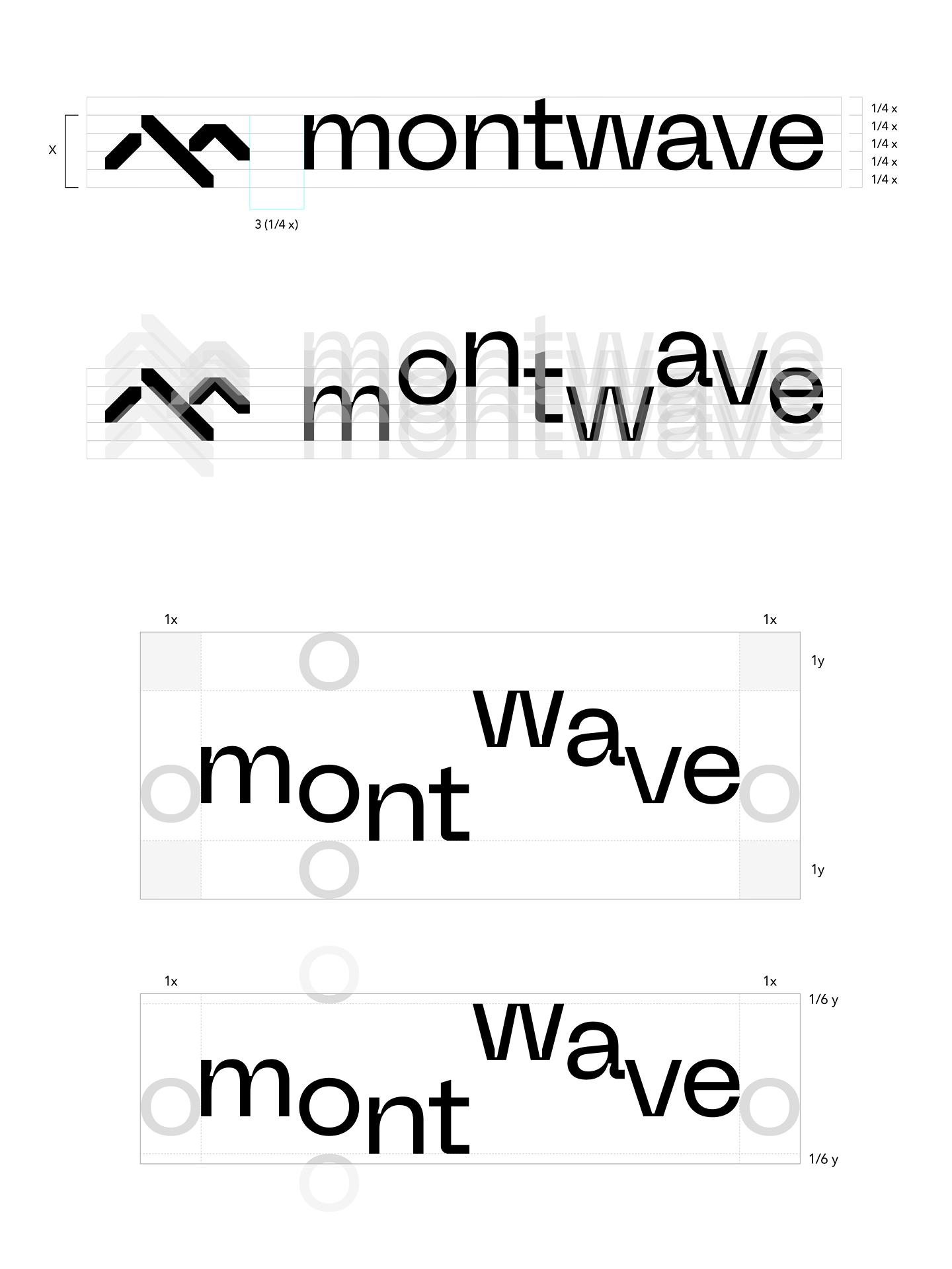
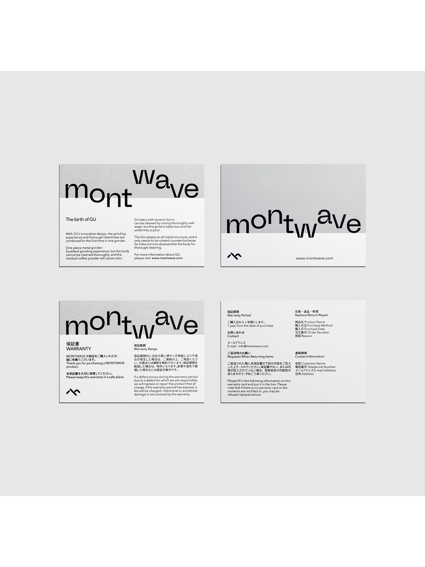
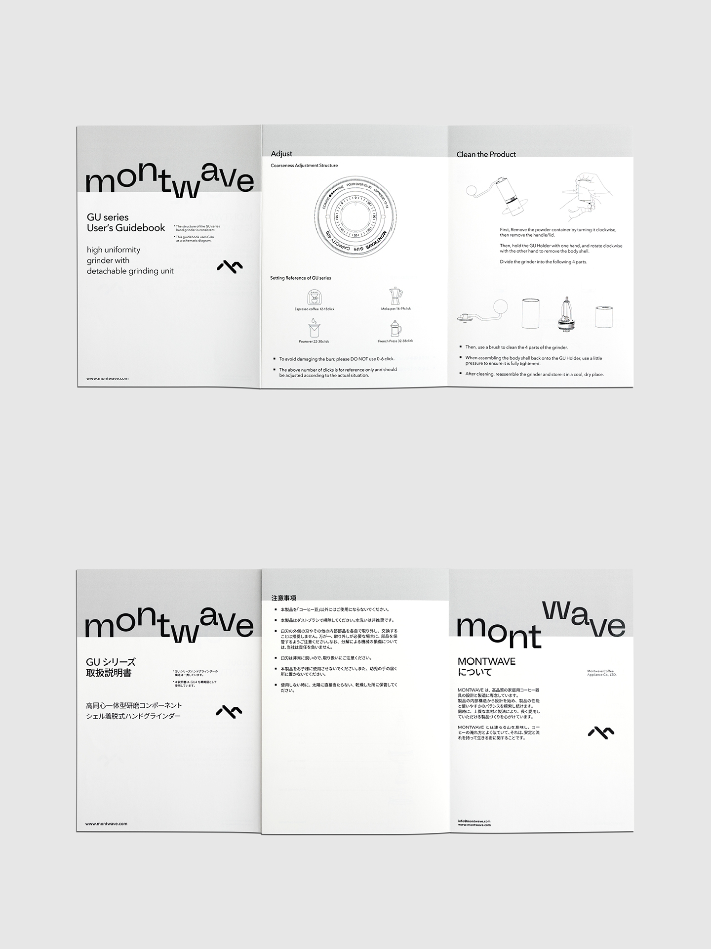
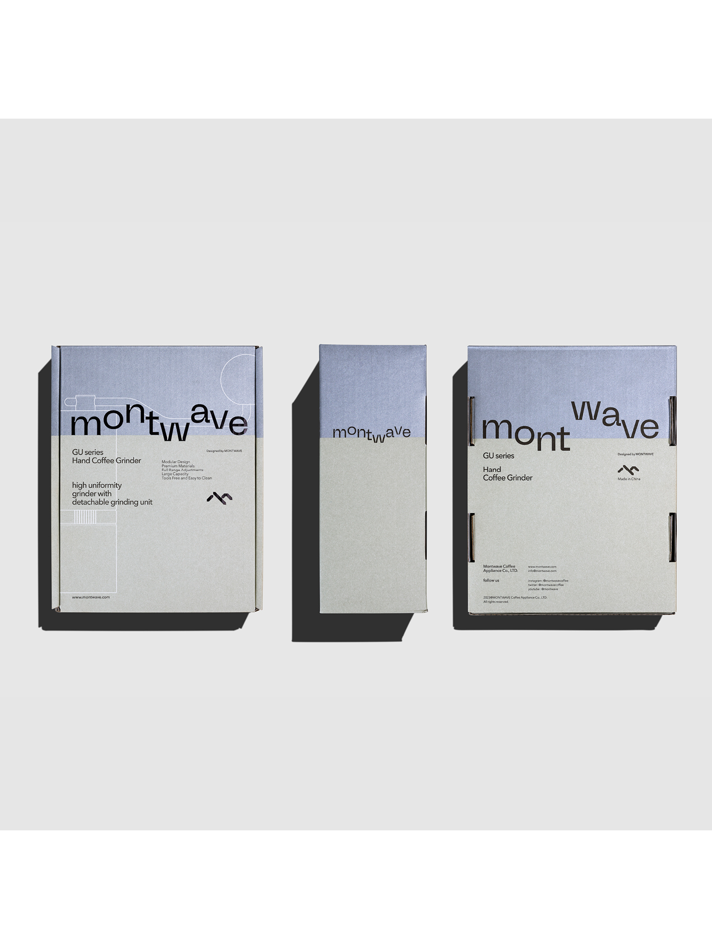
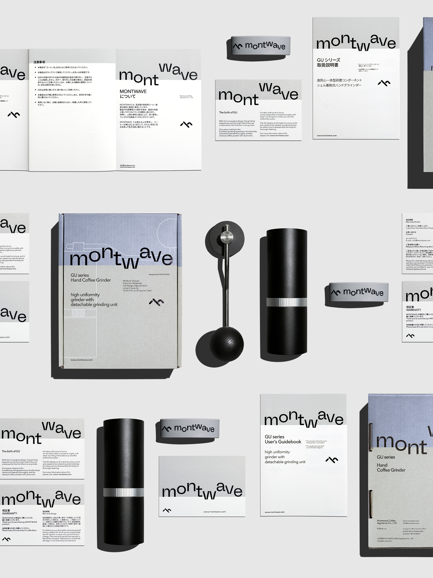
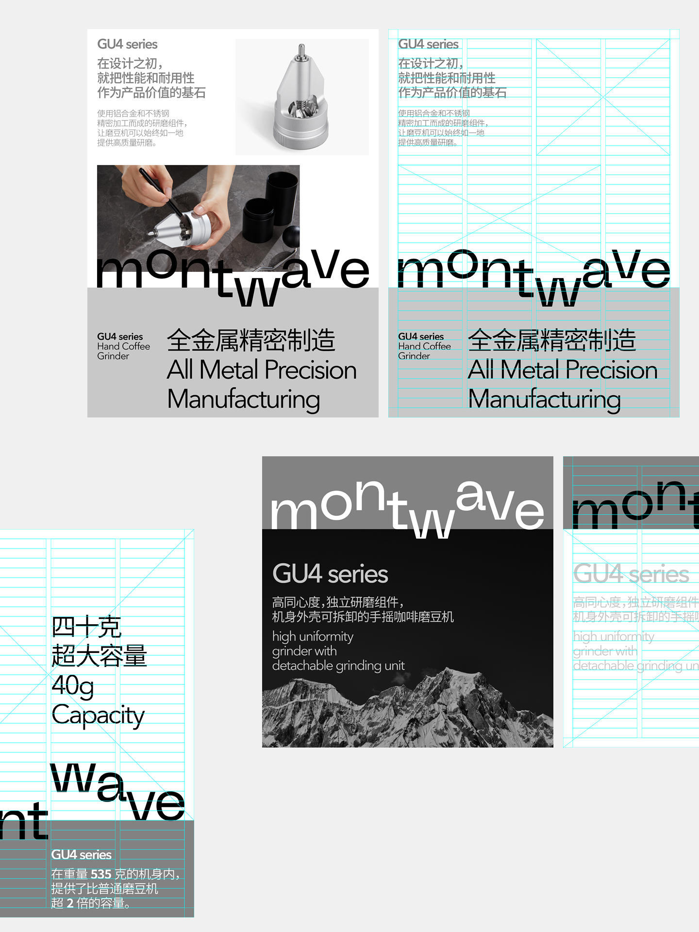
Based on the nature of “stability and flowing”, we refine it as a visual language of “continuous wave trend”. Additionally, the upper and lower areas of the layout are divided functionally as the logic of grid setup in the conceptual form of “horizon” so as to derive a diversified grid system varying with layout contents.
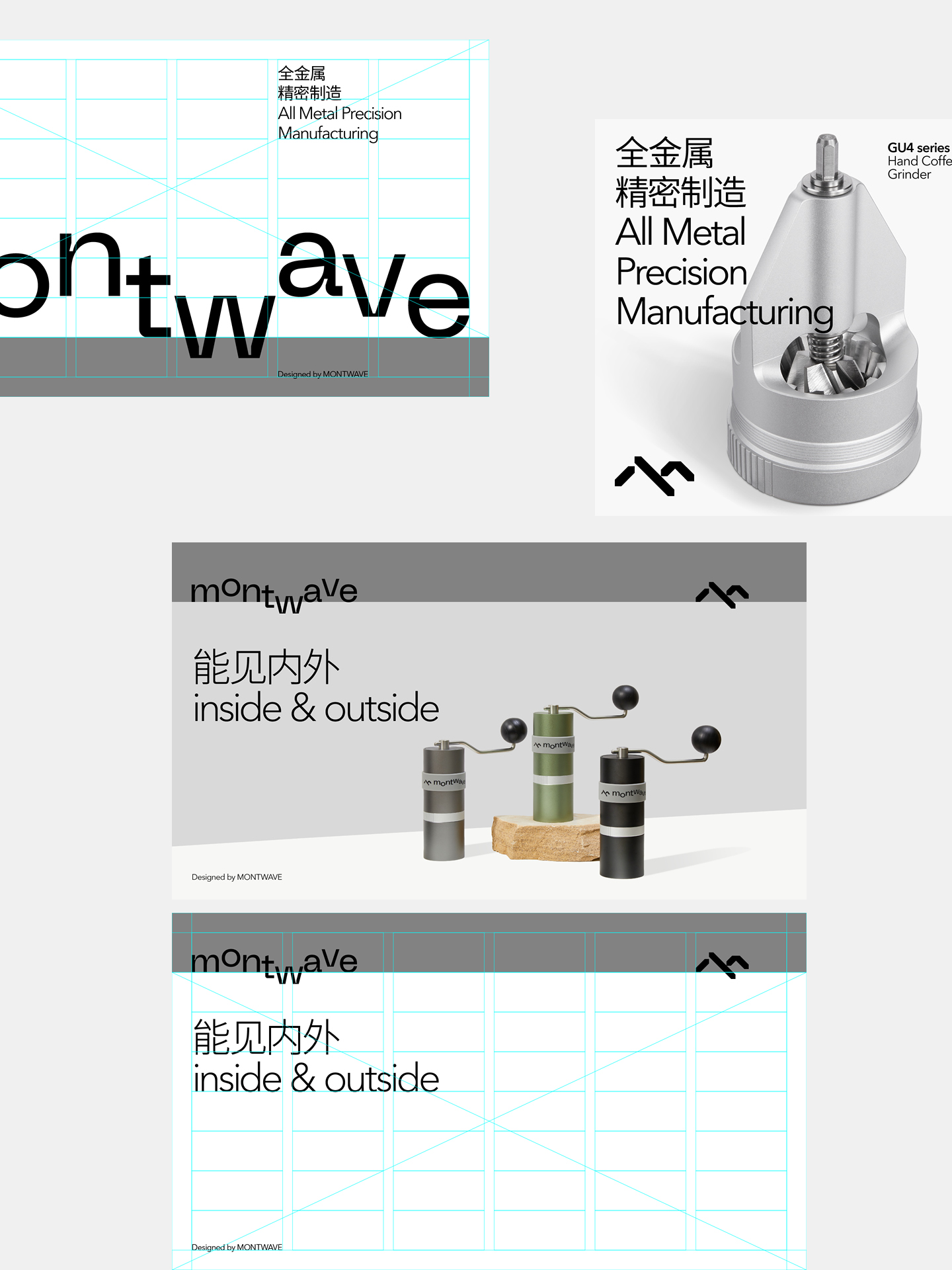
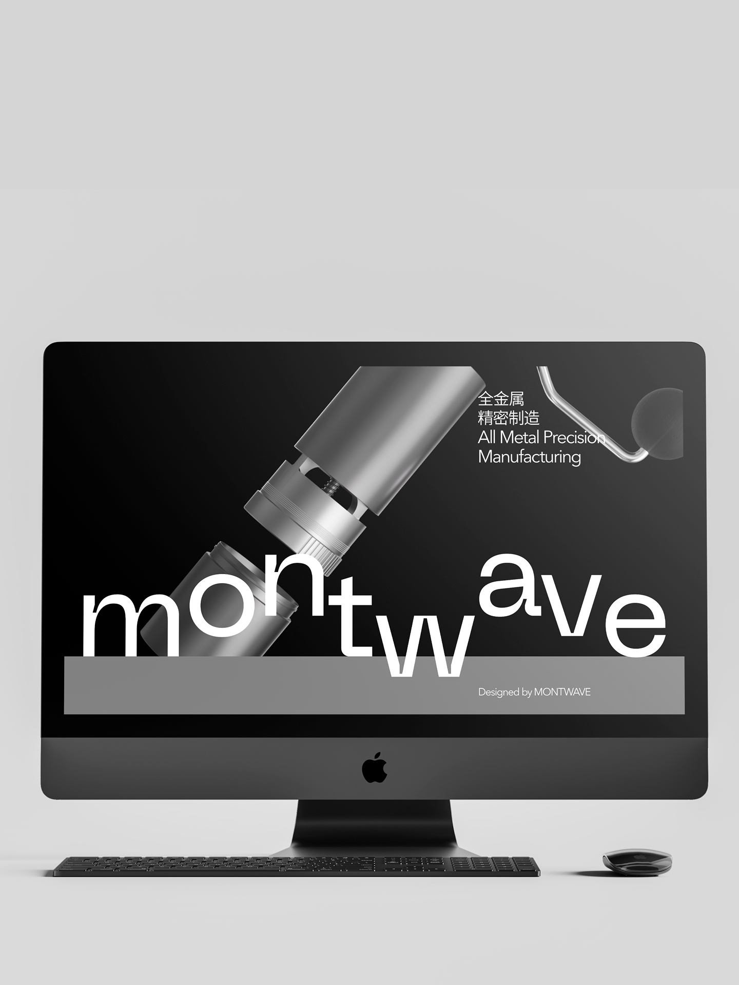
The symbol of Montwave is labelled as an extremely simple, stable and organic polygon group. It is shaped like a mountain. Its integral shape is like a unique “m” to work in concert with the first letter “m” of the brand name “Montwave”.
The arrangement of the brand logo is highly distinctive. Based on the visual langauge of wave, it is embedded into the grid system set up based on the logic of the form of "horizon". Therefore, a continuous mountain trend is derived so as to enable consumers to sufficiently experience the richness and diversification of the brand value while improving the brand memory.
The wave trend of the logo is embodied in the overall visual identity system. Its shape and position vary with contents in the specification. This makes the visual system possible to exhibit humanity emotion under the logic of rationality. We can understand this as: this is the emotional connection between rational pragmatism and sense humanity temperature.
Montwave 专注于家用精品咖啡器具的设计与制造,从产品底层逻辑和结构造型上,持续探索其在不同场景下的高性能与易用性之间的平衡。品牌坚持通过“理性、严谨且富有人文情感”的理念,以高标准、多元化的材料和生产工艺,创造出可伴随用户在长期使用下产生情感连接的产品。
我们担当了其标识、产品包装、推广物料以及电商平台视觉体系搭建的全案品牌形象设计。为品牌在全球咖啡器具细分市场上布局的崭新视觉设计,注入理性实用主义与感性人文温度连结共存的力量。
Montwave 意为连绵不断的山脉起伏趋势,这如同冲煮咖啡的过程,是一种关于稳定与流动的生活艺术。
在品牌视觉策略的制定过程中,我们的目标不仅是让品牌形象承担起视觉记忆的作用,同时亦希望建立一套具有多元可变性、统一延续性和实用功能性兼顾的视觉系统。Montwave 的视觉形象有别于以往大众对咖啡器具行业的传统印象,品牌立足于高标准工艺技术的同时,亦十分注重产品伴随用户长期使用下所产生的情感体验,这激发了我们对“稳定与流动”的重新审视与理解。
富有人文温度的情感连结,如同山脉起伏的流动性,与卓越技术所带来的高标准稳定性,共同演变而成的视觉系统是 Montwave 的重要品牌视觉形象资产。我们基于“稳定与流动”的本质,将其提炼为一种“连绵起伏趋势”的视觉语言,并以“地平线”的概念形式,将版面上下区域进行功能划分作为网格搭建的逻辑,从而根据版式内容的不同,衍生出可多元变化的网格系统。
Montwave 的图形标识为一个极简、稳定且有机的多边形群组,它形似山脉,整体造型呈现为一个独特的 “m” 型,呼应品牌名称 “montwave” 的首写字母 “m”。品牌标识的排列方式是非常特殊的,以连绵起伏的视觉语言为基础,将其置入于“地平线”形式为逻辑所搭建的网格系统,从而衍生出连绵不断的山脉形态,以此提高品牌标识记忆度的同时,也让消费者充分体会品牌价值的丰富、多元。
标识的起伏趋势体现在整体视觉系统中,它的形态与位置在规范之下可随着内容产生变化,这让视觉系统在理性的逻辑下展现出人文情感的可能性,我们可以理解为:这是理性实用主义与感性人文温度的情感连结。